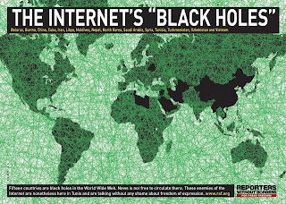
Interesting Map 1- Internet Black Holes
From Reporter's Without Borders- Published on Tuesday 7 November 2006. Updated on Tuesday 28 August 2007. By Jerry Yang. http://en.rsf.org/list-of-the-13-internet-enemies-07-11-2006,19603
Who ever said that everyone has full access to the
internet? This is a fascinating map that
represents the countries in the world that have very strict internet censorship
rules. All of the countries in the world are connected by the green lines representing the internet, but the countries that are blacked out are the ones that are burdoned by ceonsorship. Counties that are controlled by
corrupt dictators on this map were of no surprise to me. These countries including, Cuba and North
Korea, are well known for having censored lifestyles and are subjugated to
internet restricting conditions. The
thing about this map that really caught my interest where the countries I had
not known were subject to internet scrutiny by the government. Belarus is a
country that not many people would expect to have government control over
internet affairs. The government of
Belarus has control over the internet and on multiple occasions, has even
deleted websites. Another country that
is surprisingly on this list is Burma.
The government monitors all activity on the internet and even takes
screenshots of individual's activity to keep in records. They also limit internet chat services in
order to increase revenue for the state-run telecommunication companies.
Interesting Map 2- The Map of Azeroth
http://jeffstieler.com/projects/pommcheat-private-wow-server-map-hack/ By Jeff Stieler
This is the map of Azeroth, the mythical land that is the setting for the role playing video game World of Warcraft. It is a world very much like our own, with large continents divided into territories controlled by individual factions. This world is like ours in the fact that it is torn in war. The war has last many ages and is waged by the two largest factions the Horde and the Alliance. The map depicted above represents the population of Horde and Alliance population in certain regions of the world. The red dots on the map represent the Horde population as the blue dots represent the Alliance population. Just like the real world the, there are large clusters of individuals near the central cities. In the North Eastern of the eastern Kingdom is the Horde city of Silvermoon where there is a large cluster of red dots. The large populations of blue dots are surrounding the main Alliance cities of Ironforge and Stormwind. This map is interesting because it shows that even in virtual worlds the largest populations are found in the cities that are often in a coastal region.
Interesting Map 3- 2008 Election
http://election.cbsnews.com/election2008/president.shtml By Cbs News, Author UnknownWith the 2012 Election for the president of the United States coming around this November it is intriguing to look at the results for the 2008 election. This map is a representation of which candidate won the electoral vote for each state. The Blue states are those that were won by Barack Obama and the red states are those that were won by John McCain. The states in which each political wins does not change from year to year, and it will be interesting to see if this map stays the same for the upcoming election in 2012. Even thought the Republican candidate covers a larger portion of the map, Barack Obama won more states with a higher yield of electoral votes. We will see in a few months if the results are the same, or if the Republican party can somehow gain a few swing states in order to take over the white house.


